
Flow Care

Project Year
2025
Client
HoneOkello Augustine Kezzy-Founder
Industry
NGO Uganda Africa
Project Year
2025
Client
HoneOkello Augustine Kezzy-Founder
Industry
NGO Uganda Africa

My Role
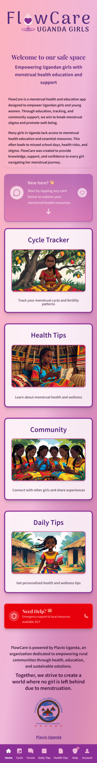
FlowCare is a mobile wellness app designed for teenage girls living in rural Ugandan communities, created in collaboration with the NGO Plavio. The goal is to offer a culturally respectful, easy-to-use way to track menstrual cycles, promote hygiene, and support girls with clear, encouraging education.
As the UX/UI and graphic designer on this project, I worked closely with the NGO’s founder to align the product vision with real community needs, while shaping both the visual identity and the interface design. This case study walks through the research, personas, and design decisions that shaped FlowCare into a compassionate, practical digital companion for its users.
Visual Identity & Branding
The visual identity for FlowCare is built to feel warm, trustworthy, and approachable for teenage girls who may be new to both smartphones and menstrual health education. Soft, uplifting colors and rounded shapes were chosen to reduce anxiety, signal safety, and move away from the clinical or stigmatizing visuals often associated with this topic.
Illustrations and iconography focus on relatable daily moments rather than medical imagery, helping users see themselves in the product and feel supported rather than judged. Typography and layout were kept clean and legible to work well on smaller, lower-end devices while maintaining a friendly, optimistic tone throughout the experience.
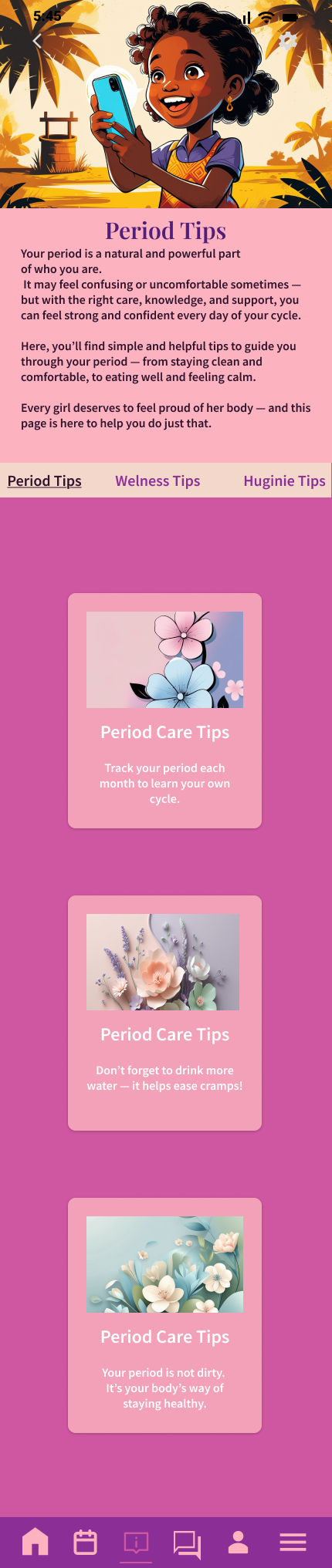
Color Palette
To support the branding, I created a custom color system using shades of pink, purple, earth tones, and soft neutrals. These colors evoke safety, warmth, and confidence—key emotional anchors for the app’s young user base.
- Pinks were used to symbolize softness and care.
- Purples convey strength, richness, and femininity.
- Pastel shades give the UI a non-intimidating, welcoming feel, especially for first-time users.
This palette was applied consistently across the app, including icons, backgrounds, cards, and buttons, ensuring brand cohesiveness and user trust.
Visual Identity & Branding
The visual identity for FlowCare is built to feel warm, trustworthy, and approachable for teenage girls who may be new to both smartphones and menstrual health education. Soft, uplifting colors and rounded shapes were chosen to reduce anxiety, signal safety, and move away from the clinical or stigmatizing visuals often associated with this topic.
Illustrations and iconography focus on relatable daily moments rather than medical imagery, helping users see themselves in the product and feel supported rather than judged. Typography and layout were kept clean and legible to work well on smaller, lower-end devices while maintaining a friendly, optimistic tone throughout the experience.
Color Palette
To support the branding, I created a custom color system using shades of pink, purple, earth tones, and soft neutrals. These colors evoke safety, warmth, and confidence—key emotional anchors for the app’s young user base.
- Pinks were used to symbolize softness and care.
- Purples convey strength, richness, and femininity.
- Pastel shades give the UI a non-intimidating, welcoming feel, especially for first-time users.
This palette was applied consistently across the app, including icons, backgrounds, cards, and buttons, ensuring brand cohesiveness and user trust.
The Challenge
Designing for Limited Digital Access & Health Literacy
Designing FlowCare was not only a design brief but a socially driven challenge that required empathy, cultural sensitivity, and practical constraints in mind. As a menstrual health app for girls in rural and underserved Ugandan communities, the product needed to address limited connectivity, low health literacy, emotional stigma, and first-time smartphone use all at once.
Limited Digital Access
Many potential users rely on shared, low-end smartphones with unstable internet and very limited data. FlowCare therefore needed to be lightweight, data-efficient, and usable in low-connectivity contexts, with key content structured so it could be accessed even when the connection is poor or intermittent.
Low Health Literacy&Menstrual Stigma
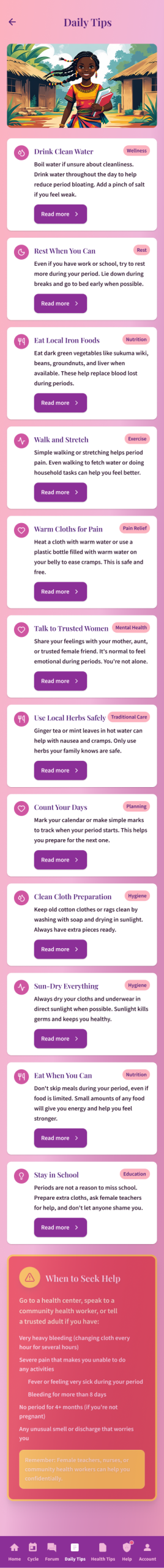
Menstruation is still a taboo topic in many communities, and formal reproductive education can be scarce. Content had to use plain, respectful language and supportive visuals so that complex health concepts became easy to understand and emotionally safe to explore.
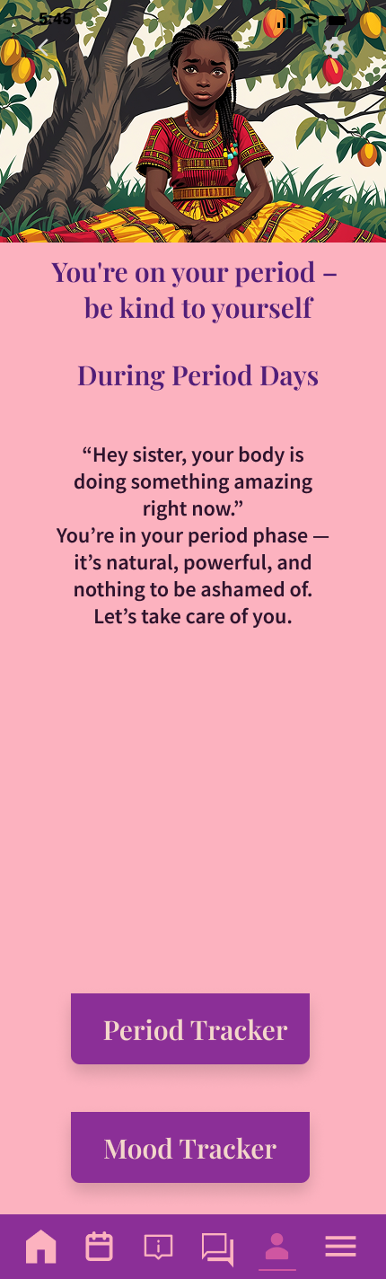
Emotional Safety&Trust
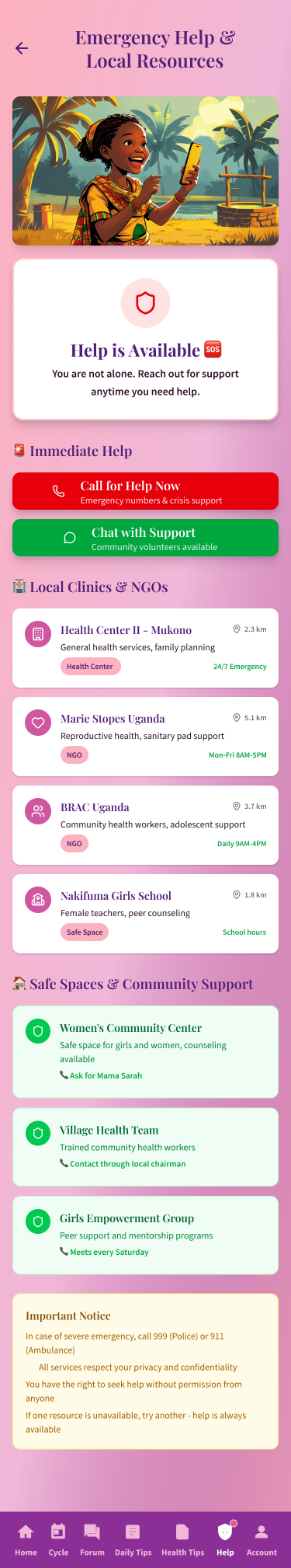
For many girls, FlowCare might be the first private, non-judgmental space where they can learn about their bodies. The tone of voice, illustrations, and interaction patterns were all designed to feel warm, encouraging, and protective, with community features that emphasize sisterhood rather than shame.
Ensuring Cultural Relevance
Most existing wellness apps are tailored to Western audiences, which can make them feel distant or inappropriate in other contexts. FlowCare’s visuals, characters, and examples were intentionally grounded in African settings and everyday realities so that users could immediately recognize themselves in the experience.
First-Time Smartphone Users
Many users were expected to have limited prior experience with mobile apps. This led to an emphasis on simple flows, large tap targets, linear navigation, and clear feedback, helping girls build confidence as they learned to navigate both the app and their own health.
UX/UI Designer & Developer
As the sole designer on FlowCare, the responsibility covered the full UX/UI process, visual identity, and storytelling for the product. This included defining the overall experience, crafting the logo and brand system, designing key user flows, and creating the high-fidelity screens that bring the app to life.
Key contributions:
- Visual identity and logo that express compassion, empowerment, and dignity
- Custom color palette and UI components tailored to low-end devices and young users
- Layouts and screen flows for core features like cycle tracking, education, community, and logging
- Illustrations and icons that reflect local culture and daily life
- UX decisions shaped around connectivity constraints and first-time smartphone use
The project combined health research, advocacy, and user-centered design, turning a sensitive topic into a supportive, accessible digital experience.
Tools Used
The FlowCare experience was shaped using a mix of UX, visual, and AI-assisted tools that supported both speed and cultural relevance.
- Figma:
Used as the main environment for wireframes, design systems, and interactive prototypes. Screens, components, and flows were iterated here to ensure clarity, consistency, and flexibility across devices. - Canva:
Helpful for exploring layout directions, testing typographic hierarchy, and preparing presentation-ready visuals to communicate the concept with stakeholders. - Adobe Illustrator & Photoshop:
Used to refine icons, polish illustrations, and ensure that all visual assets remained crisp, legible, and on-brand at different sizes and resolutions. - Leonardo AI:
Used to generate culturally relevant illustrations and character concepts that reflect African girls and village environments. AI outputs were then curated and refined so the visuals felt authentic, emotionally expressive, and aligned with the app’s tone of care and empowerment.
Combining these tools made it possible to move efficiently from concept to detailed UI, while still giving space for nuance, storytelling, and cultural sensitivity.


User Research & Personas
To ground FlowCare in real user needs, a set of representative personas was developed based on the project brief, contextual research, and direct conversations with the NGO founder in Uganda. Communication across time zones and differing connectivity made ongoing dialogue challenging, so after an initial conversation with him, Perplexity AI was used to help structure additional background research and refine assumptions about the context.
These personas represent three distinct user archetypes, each with unique barriers, needs, and goals.
These three personas shaped every design decision, ensuring that FlowCare serves girls at different life stages and roles—from first-time users seeking knowledge and reassurance, to emerging leaders and educators wanting to support their communities.


High-Fidelity Wireframes
The high-fidelity wireframes translate FlowCare’s concept into a cohesive, interactive product across key flows and screens. Each screen is designed with large tap targets, clear visual hierarchy, and minimal cognitive load so that first-time smartphone users can navigate confidently.

Features Overview
Menstrual Cycle
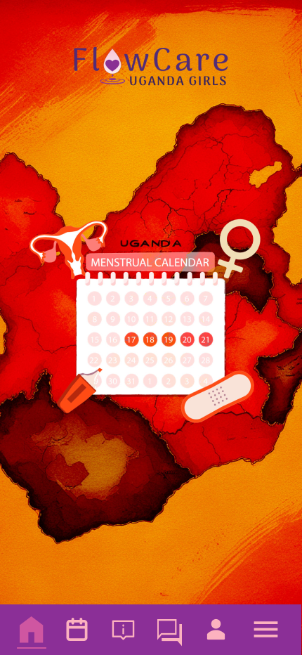
At the heart of FlowCare is a clean, visual calendar tracker that helps users understand their body’s natural rhythm.
The cycle display uses color coding and intuitive symbols so that users can quickly see predicted period days, fertile windows, and wellness patterns.
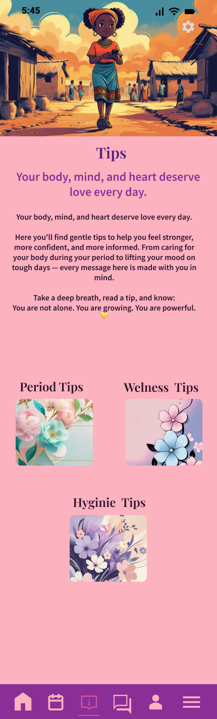
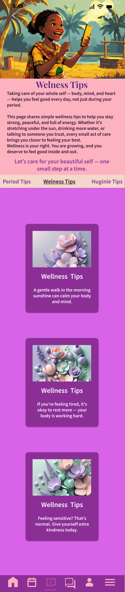
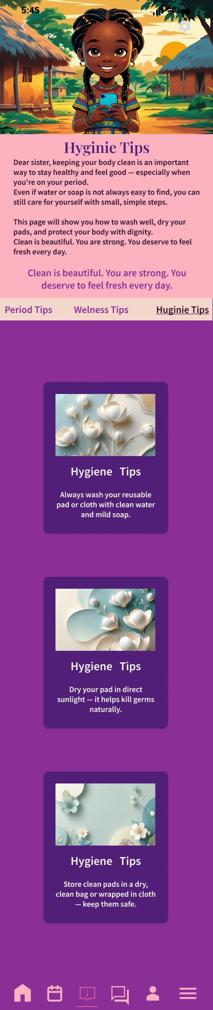
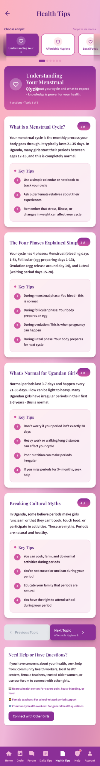
Educational Resources
Educational modules cover essential topics like hygiene practices, period wellness, body changes, and reproductive health. Content is structured in short, digestible lessons paired with culturally relevant illustrations so that girls at any literacy level can understand and retain the information.
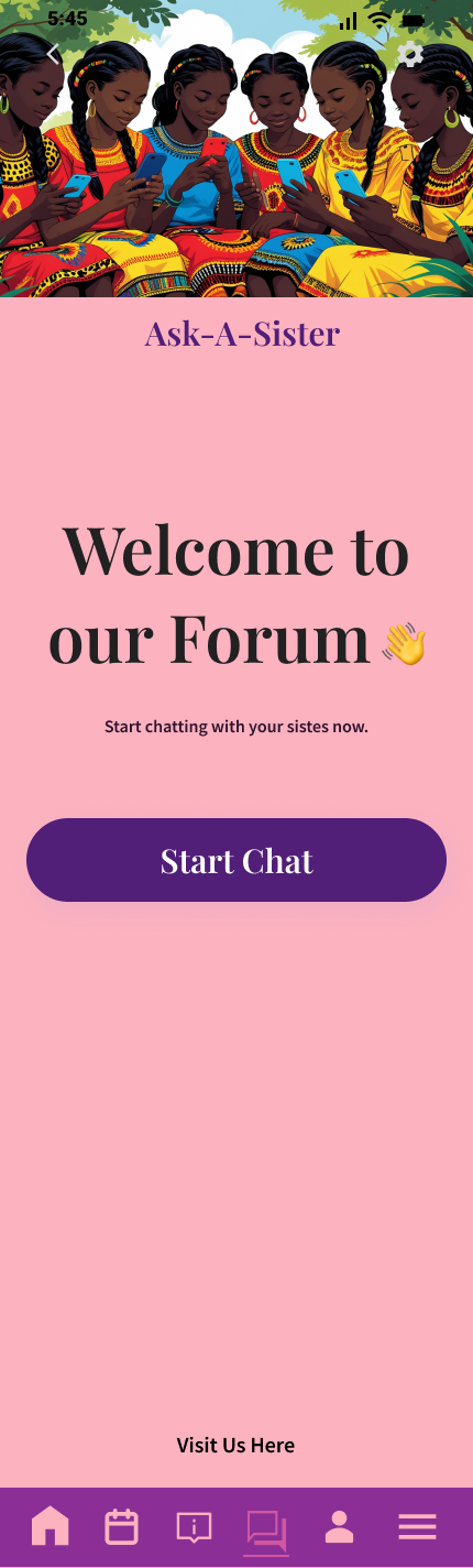
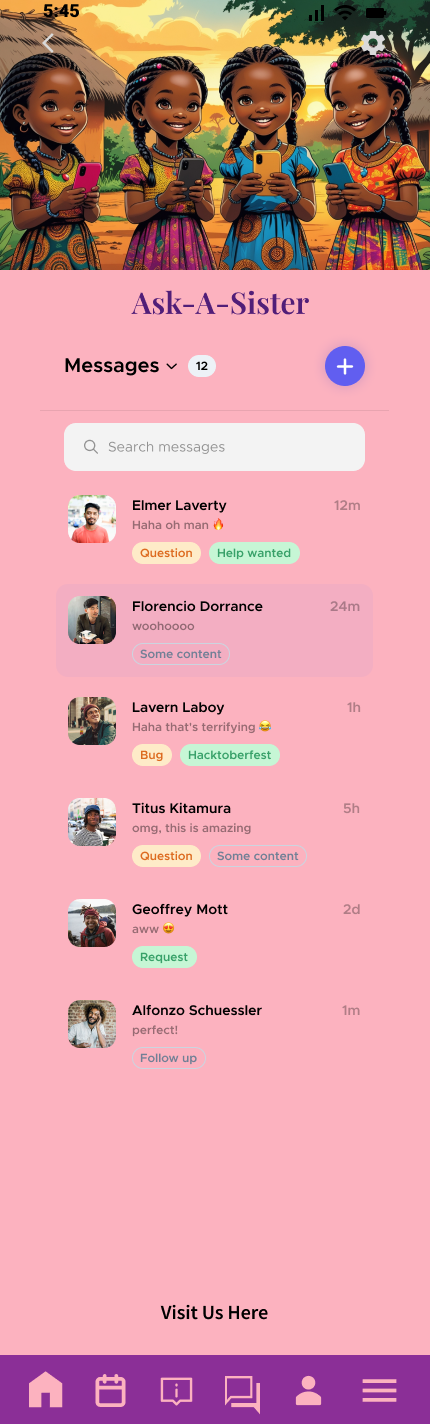
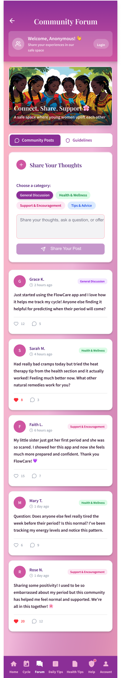
Ask-A-Sister
Ask-A-Sister is a community-driven forum where girls can post questions anonymously and receive thoughtful answers from trusted sources and peers. The feature is moderated to ensure safety and respect, creating a space where no question is too embarrassing or insignificant.
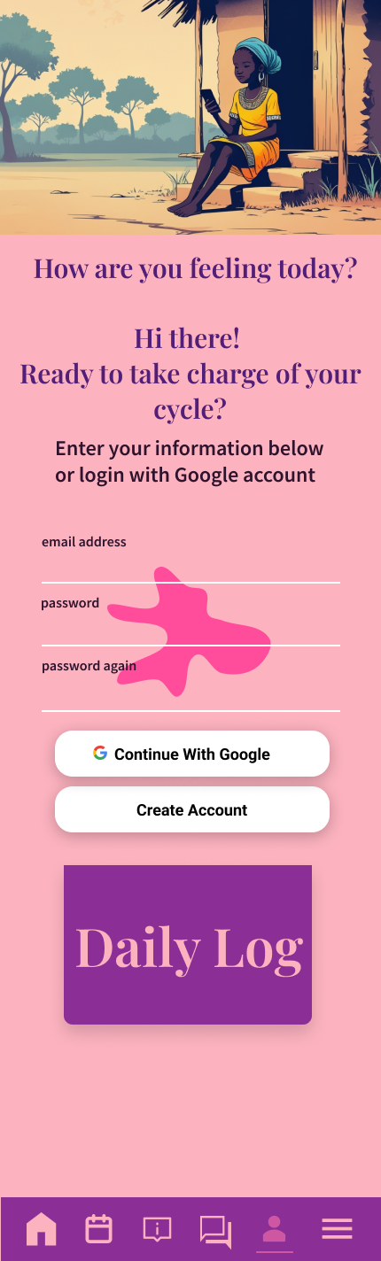
Daily Log
The Daily Log allows users to track their mood, physical symptoms, and daily experiences in a quick, low-pressure way. Over time, patterns emerge—connections between cycle phases, emotions, and bodily sensations become visible. This builds self-awareness, helps girls anticipate their needs, and creates valuable data that can support conversations with guardians or healthcare providers.
Offline Considerations
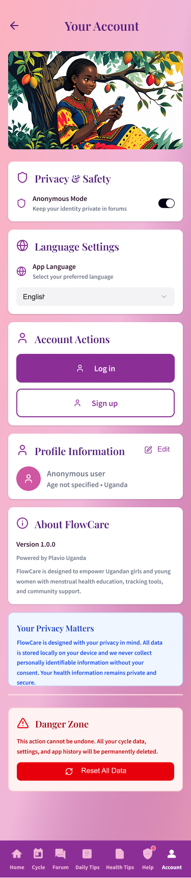
Because internet connectivity is inconsistent in many rural areas, FlowCare is designed with low-data usage as a priority. Core content is structured so it can be accessed with minimal connectivity, and a roadmap exists for future offline caching and downloadable content.
Menstrual Cycle
At the heart of FlowCare is a clean, visual calendar tracker that helps users understand their body’s natural rhythm.
The cycle display uses color coding and intuitive symbols so that users can quickly see predicted period days, fertile windows, and wellness patterns.
Educational Resources
Educational modules cover essential topics like hygiene practices, period wellness, body changes, and reproductive health. Content is structured in short, digestible lessons paired with culturally relevant illustrations so that girls at any literacy level can understand and retain the information.
Ask-A-Sister
Ask-A-Sister is a community-driven forum where girls can post questions anonymously and receive thoughtful answers from trusted sources and peers. The feature is moderated to ensure safety and respect, creating a space where no question is too embarrassing or insignificant.
Daily Log
The Daily Log allows users to track their mood, physical symptoms, and daily experiences in a quick, low-pressure way. Over time, patterns emerge—connections between cycle phases, emotions, and bodily sensations become visible. This builds self-awareness, helps girls anticipate their needs, and creates valuable data that can support conversations with guardians or healthcare providers.
Offline Considerations
Because internet connectivity is inconsistent in many rural areas, FlowCare is designed with low-data usage as a priority. Core content is structured so it can be accessed with minimal connectivity, and a roadmap exists for future offline caching and downloadable content.
Figma Makeathon Participation
From Wireframes to Interactive Prototype
In 2025, I participated in the Figma Makeathon powered by Contra—a vibrant global competition where thousands of designers pushed creative boundaries using Figma’s latest AI-assisted design and prototyping tools. The challenge was an exciting opportunity to evolve FlowCare from a concept into a fully realized, interactive digital experience.
Using Figma Make’s rapid prototyping and AI-assisted design features, I:
- Refined the wireframe layouts with polished visual design and consistent components across all screens.
- Built complete user flows for onboarding, cycle tracking, education, and community features.
- Created interactive prototypes showcasing realistic user journeys.
- Developed a story-driven Figma website to communicate FlowCare’s mission and impact.
The final result is a competition-ready prototype that demonstrates how thoughtful UX research, combined with modern AI-assisted tools, creates meaningful digital solutions.
Design Complete Impact Pending
Design Complete Impact Pending
FlowCare is a fully-designed, interactive prototype that demonstrates how thoughtful UX design can create meaningful solutions for real-world challenges. Every design choice—from the visual identity to the supportive tone—was intentional: to empower girls to take control of their menstrual health on their own terms.
The project showcases how user-centered design, grounded in authentic research and cultural understanding, creates solutions that are both beautiful and deeply human.
Through the 2025 Figma Makeathon, I refined the prototype using AI-assisted tools and created a story-driven demonstration website to communicate FlowCare’s mission and impact. Every design choice—from the empowering pink and purple color palette to the supportive, stigma-free tone—was intentional, aiming to give girls control over their menstrual health on their own terms.
The prototype is complete and ready for development. To bring FlowCare to life, the NGO is actively seeking funding. Once resources are secured, the prototype will be handed to development partners to build and deploy the native mobile app.