Unpredictable Darkness

Project Year
2024
Client
Honey Kasper / Independent Author
Industry
Book Publishing
Project Year
2024
Client
Honey Kasper / Independent Author
Industry
Beauty&


My Role
My journey with “Unpredictable: The Walk In and Out of Darkness” wasn’t just about redesigning a website; it was about creating a digital sanctuary for a powerful true story of survival, faith, and transformation.
Honey Kasper’s memoir is a raw, unflinching account of overcoming childhood trauma, abuse, cancer, and 79 surgeries—a testament to the resilience of the human spirit. However, as an independent author entering the competitive book publishing market, Honey faced a significant challenge: her original website failed to capture the emotional depth of her story or effectively connect with the diverse audiences who needed to hear her message.
The existing site was outdated, lacked cohesive branding, and didn’t resonate with potential readers seeking stories of hope, healing, and triumph over adversity. My role was to transform her digital presence into an immersive experience that would honor her journey while strategically positioning her book in the memoir and self-help market.
My Responsibilities
- UX/UI Design: Creating a user-friendly and intuitive website experience that guided visitors through the book’s story and message. This involved developing wireframes, prototypes, and user flows to ensure seamless navigation and engagement.
- Visual Design: Developing a cohesive and emotionally resonant visual identity for the website, including the selection of colors, typography, and imagery that aligned with the book’s themes.
- Graphic Design: Designing the “From Darkness to Triumph” logo, a central element of the brand identity, and creating other supporting graphics for the website.
- AI-Powered Visuals: Leveraging Leonardo AI to generate unique and thematic images that brought the book’s world to life in a visually compelling way.
- Website Development: Implementing the design using Elementor on WordPress, ensuring a responsive and functional website.
Brand Identity:
Visualizing Hope &
Resilience

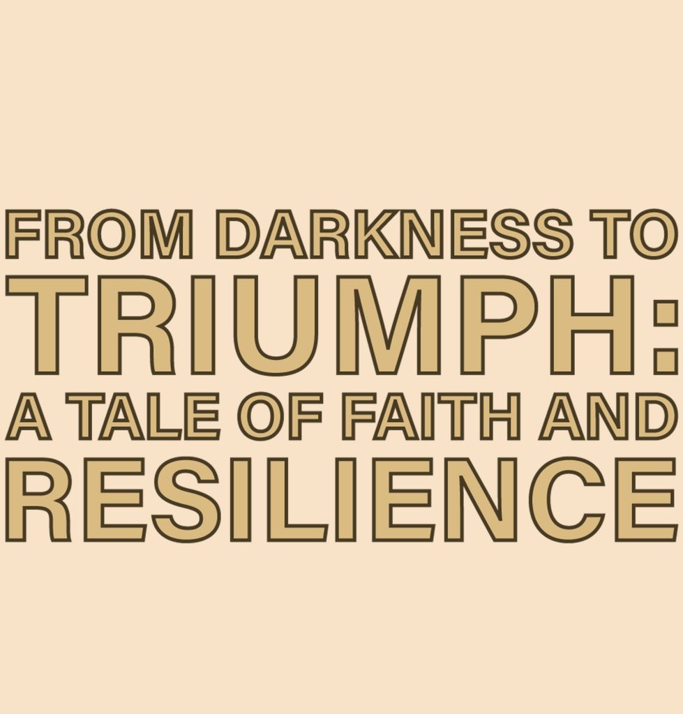
In addition to the website’s overall design, I also developed a logo to encapsulate the book’s core message:
From Darkness to Triumph: A tale of Faith and Resilience. This logo was designed to be both impactful and
easily recognizable.
Honey Kasper’s story is a testament to the strength of the human spirit. This logo isn’t just a design; it’s a
visual embodiment of her journey, intended to instantly communicate the core message of the book: that
even in the darkest of times, triumph is possible through faith and resilience. My goal was to create a logo that
was both powerful and easily recognizable, serving as a constant reminder of this message.
Every element of the logo was carefully considered to convey the desired meaning:
- The Phrase Itself: “FROM DARKNESS TO TRIUMPH: A Tale of Faith and Resilience” is not just a tagline; it’s
the foundation. It’s deliberately included to immediately convey the book’s narrative. - The Hierarchy: Note the emphasis on “TRIUMPH.” By making it the largest word, it’s the írst thing the eye
is drawn to, reinforcing the message of hope and victory. - The Color Palette: The combination of light gold and black is intentional. The gold symbolizes hope,
achievement, and the “light” at the end of the tunnel. The black represents the initial struggles, hardships,
and moments of darkness that must be overcome. The gold outline subtly highlights the letters from the
black background
The Font: I chose a bold, sans-serif font for its strength, clarity, and modern appeal. It needed to be
something solid and unwavering to mirror the strength of the author’s spirit. - Balance: The dark outline on the letters create a balanced look to the logo, highlighting them,
Brand Identity:
Visualizing Hope &
Resilience
In addition to the website’s overall design, I also developed a logo to encapsulate the book’s core message:
From Darkness to Triumph: A tale of Faith and Resilience. This logo was designed to be both impactful and
easily recognizable.
Honey Kasper’s story is a testament to the strength of the human spirit. This logo isn’t just a design; it’s a
visual embodiment of her journey, intended to instantly communicate the core message of the book: that
even in the darkest of times, triumph is possible through faith and resilience. My goal was to create a logo that
was both powerful and easily recognizable, serving as a constant reminder of this message.
Every element of the logo was carefully considered to convey the desired meaning:
- The Phrase Itself: “FROM DARKNESS TO TRIUMPH: A Tale of Faith and Resilience” is not just a tagline; it’s
the foundation. It’s deliberately included to immediately convey the book’s narrative. - The Hierarchy: Note the emphasis on “TRIUMPH.” By making it the largest word, it’s the fírst thing the eye
is drawn to, reinforcing the message of hope and victory. - The Color Palette: The combination of light gold and black is intentional. The gold symbolizes hope,
achievement, and the “light” at the end of the tunnel. The black represents the initial struggles, hardships,
and moments of darkness that must be overcome. The gold outline subtly highlights the letters from the
black background
The Font: I chose a bold, sans-serif font for its strength, clarity, and modern appeal. It needed to be
something solid and unwavering to mirror the strength of the author’s spirit. - Balance: The dark outline on the letters create a balanced look to the logo, highlighting them,

The Challenge
Bridging The Gap Between Page And Reader
When Honey Kasper approached me to redesign her author website for “Unpredictable: The Walk In and Out of Darkness,” the existing site wasn’t effectively connecting with her target audience.
The original website was outdated and failed to capture the emotional depth and transformative message of her memoir—a powerful story of surviving childhood abuse, battling cancer through 79 surgeries, and ultimately becoming an award-winning advocate for mental health and trauma survivors.
Balancing Heavy Content with Hope
The book deals with severe trauma: childhood abuse, maternal neglect, molestation, cancer, and PTSD. However, the central message is one of triumph, faith, and resilience. The website needed to acknowledge the darkness without overwhelming potential readers, while emphasizing the journey toward light and healing.
Reaching Multiple Audiences
The book serves several distinct reader groups:
- Trauma survivors seeking validation and hope
- Mental health professionals looking for resources and patient perspectives
- Faith-based readers drawn to stories of spiritual strength
- General memoir readers interested in true survival stories
Building Trust and Credibility
For readers to engage with such vulnerable, personal content, they needed to trust the author. The website had to establish Honey's credibility as both a survivor and an award-winning advocate who has earned national and international recognition for her community work.
Creating Emotional Resonance
The old website was disconnected from the book's powerful emotional core. I needed to create a visual and narrative experience that would:
- Communicate the "darkness to triumph" journey through design
- Use typography, color, and imagery to evoke hope rather than despair
- Make visitors feel inspired rather than overwhelmed
- Encourage action (purchasing the book, connecting with Honey)
Establishing a Strong Brand Identity
As an independent author and mental health advocate, Honey needed a cohesive visual identity that could extend beyond the website to social media, speaking engagements, and advocacy work. The site required a memorable logo and consistent design system.
Mood Board
- Core Message: Encapsulate the story’s journey from darkness to triumph.
- Palette: A blend of dark olive, gold, and gray reflects struggles and hope.
- Imagery (Leonardo AI): Images of hope, struggle, and faith were custom-generated using Leonardo AI to create unique, thematic visuals.
- Fonts: Oswald (headings) and Source Sans Pro (body) ensure readability and visual impact.
- Overall Goal: To create an inspiring and deeply engaging digital experience reîecting the book’s core message.

User Research & Personas
High-Fidelity Wireframes
After completing user research and defining our target personas, I moved into the high-fidelity wireframing phase—where strategic insights transformed into tangible design solutions. These wireframes represent the bridge between conceptual planning and final implementation, showcasing how user needs, brand identity, and technical requirements converged into a cohesive digital experience.
This high-fidelity wireframing phase was crucial for transforming user research insights and brand strategy into a concrete, user-centered design that honored Honey Kasper’s powerful story while strategically positioning her for success in the competitive memoir market.
Final Outcome & Impact
- Enhanced Visual Appeal: The website now boasts a visually stunning design that perfectly captures the book’s unique atmosphere, thanks to the strategic use of color, typography, and Leonardo AI-generated imagery.
- Improved User Experience: The simplified navigation and information architecture make it easy for visitors to find key information and engage with the book.
- Stronger Brand Identity: The consistent use of the “From Darkness to Triumph” logo and other visual elements creates a cohesive brand identity that resonates with readers on an emotional level.
- Mobile Optimization: The responsive design ensures a seamless experience for all users, regardless of device.


