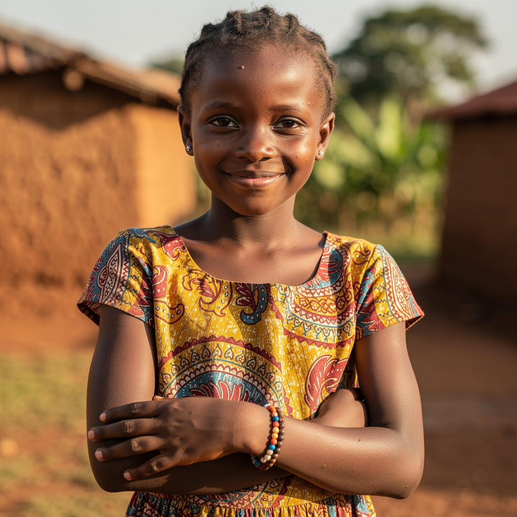


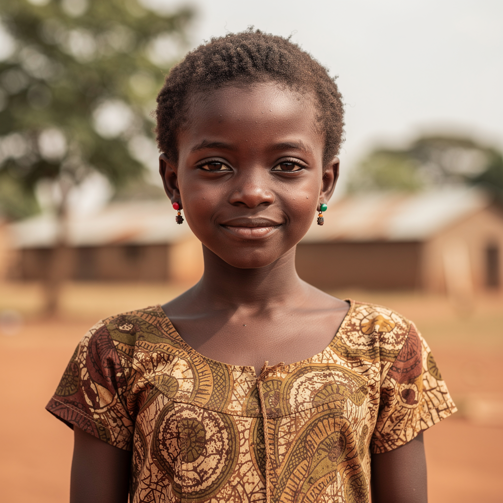
Joan
The First-Time User
Bio
Joan is the eldest sister in her family and often takes the lead in caregiving. Though she never received menstrual education, she's eager to guide her younger sisters with knowledge and dignity.
Goals
- Learn to support her sisters
- Gain accurate wellness knowledge
- Connect with peers in similar situations
Pain Points
- Never received formal menstrual education
- Struggles to explain things clearly to younger girls
- Lacks a network to share experiences
App Needs
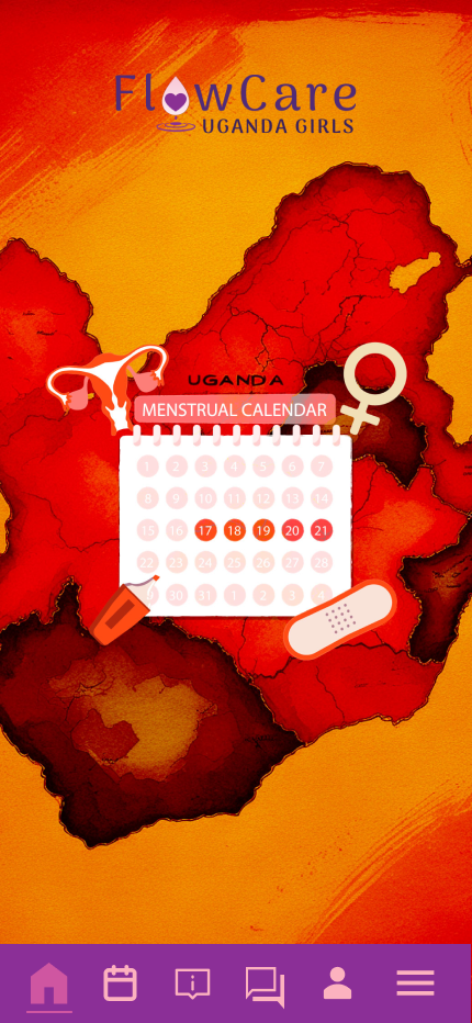
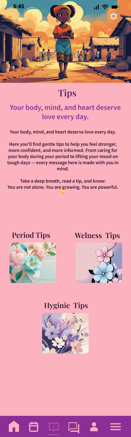
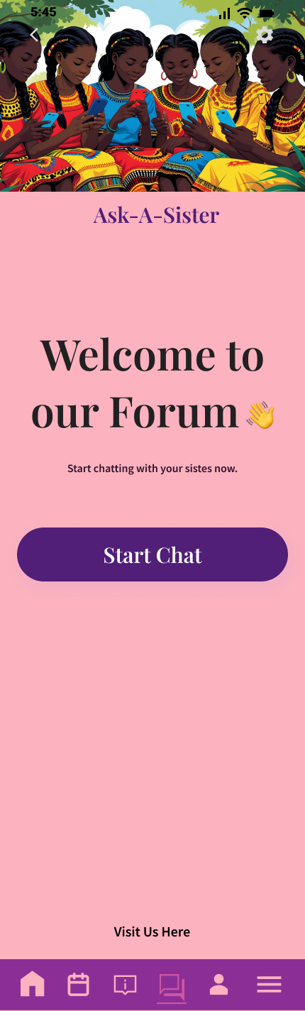
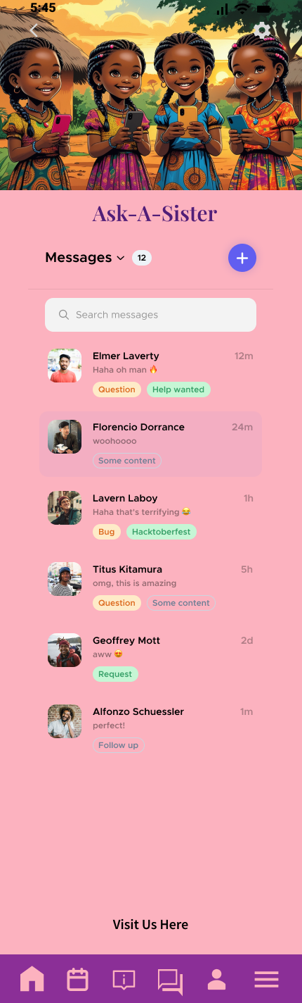
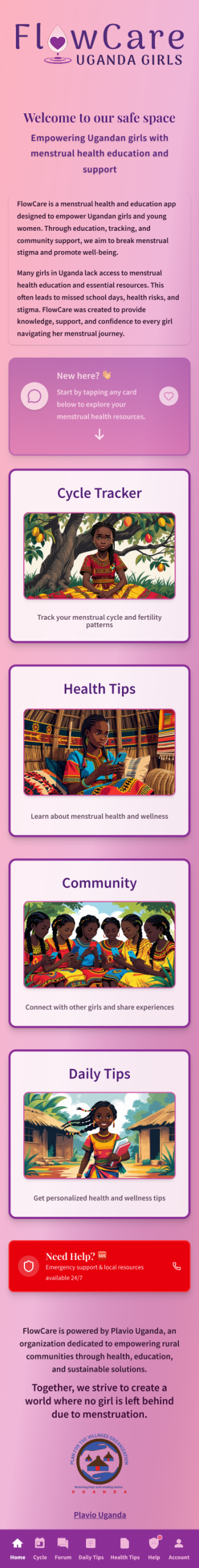
- Peer chat and discussion forum
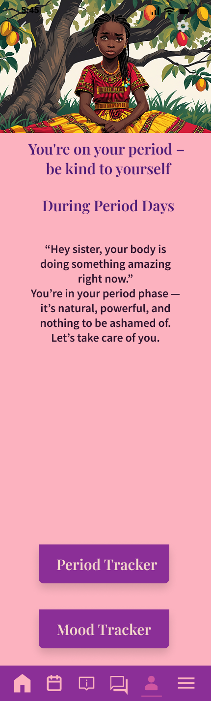
- Wellness education in simple language
- Shareable learning tools
I want to know what to tell my sisters when they ask me what's happening to their bodies.