
City Dermatology

Project Year
2023
Client
Imran A./ City Dermatology Institute
Industry
Cosmetics & Beauty
Project Year
2023
Client
Imran A./ City Dermatology Institute
Industry
Cosmetics & Beauty
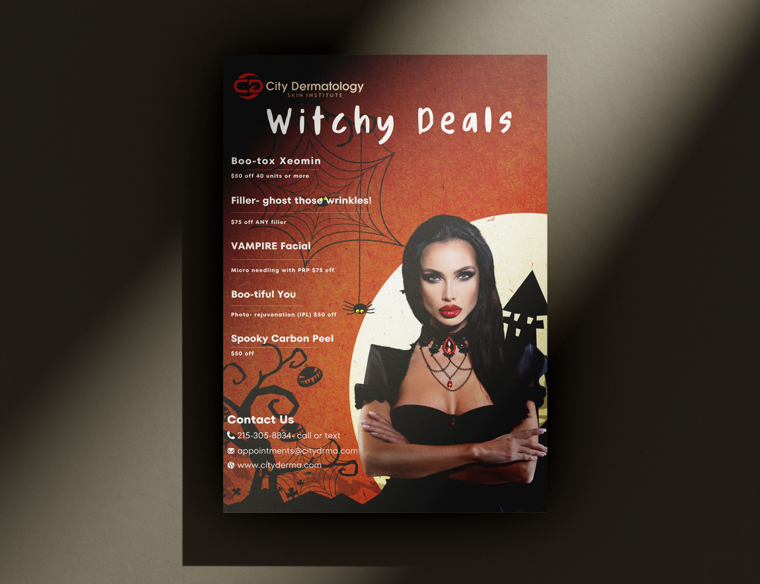

Halloween Campaign
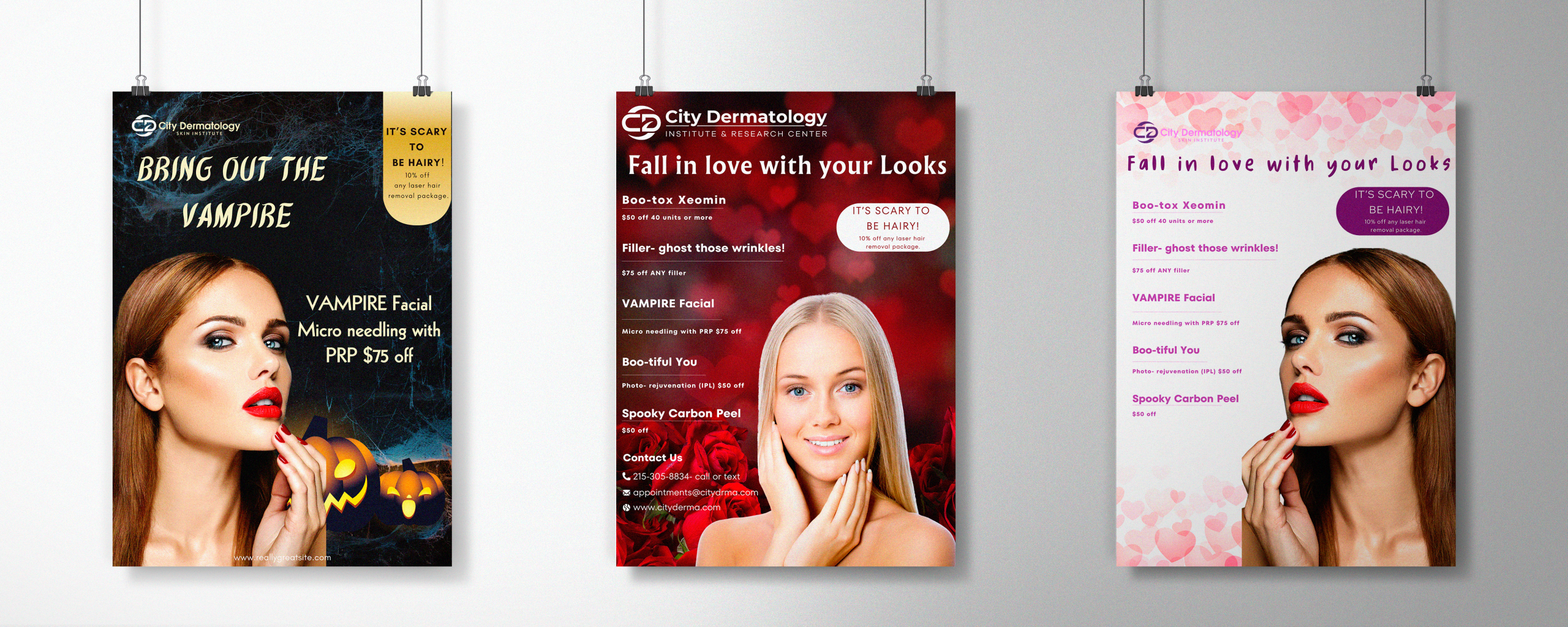
City Dermatology Skin Institute commissioned a captivating series of Halloween-themed promotional posters to drive seasonal package bookings and elevate their spooky season skincare offerings. This five-poster campaign seamlessly blends holiday aesthetics with professional dermatological branding, creating compelling promotional materials that transformed treatment promotions into must-see seasonal events.
Each design strategically showcases the clinic’s signature treatments—from vampire-inspired facials to exotic spa packages—positioned as exclusive Halloween promotion offers.
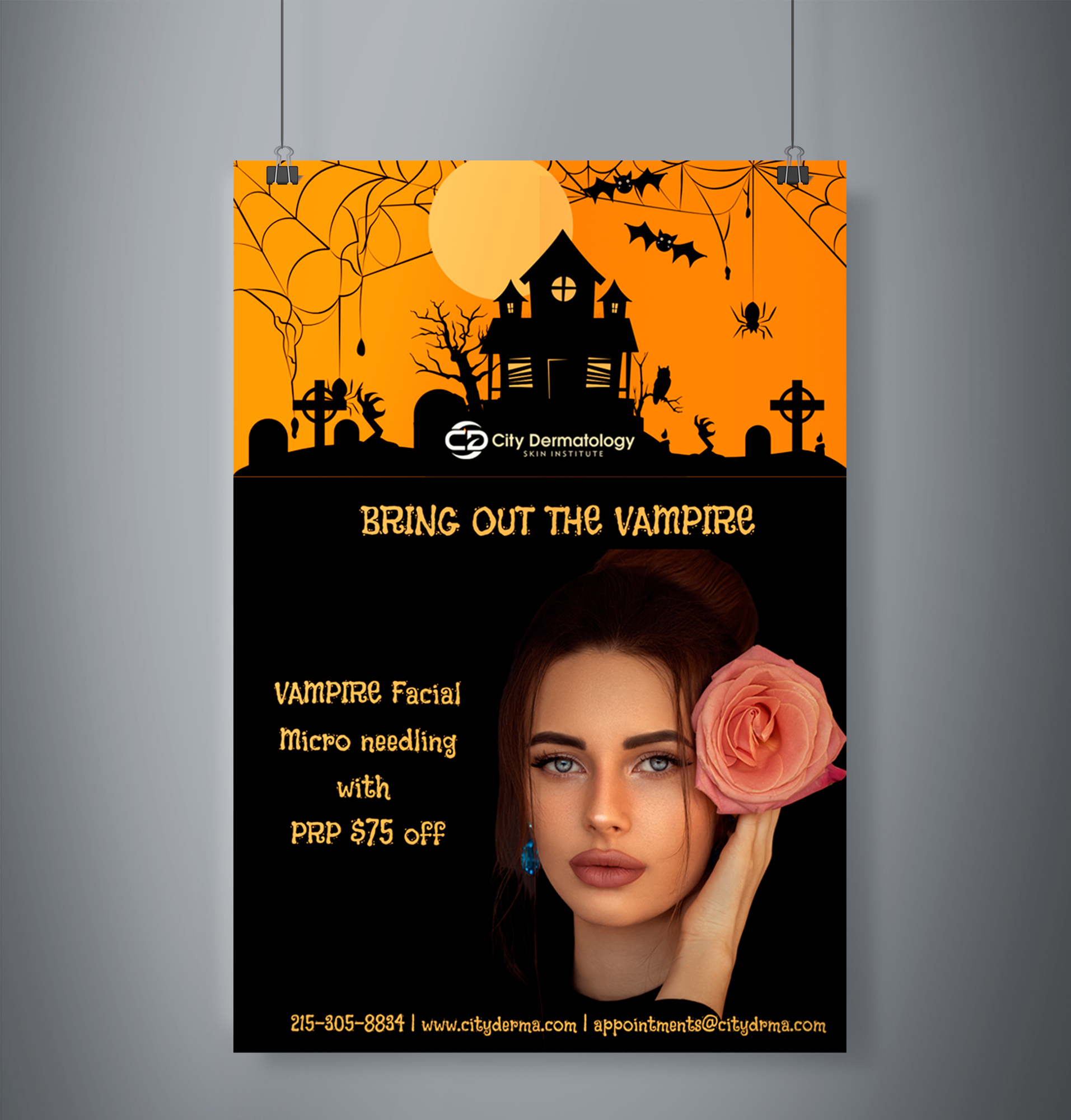
The Challenge
The primary design challenge was creating a cohesive Halloween-themed poster series that would drive bookings for seasonal promotion packages without compromising the clinic’s upscale, professional image. Each poster needed to spotlight specific treatments—vampire facials, microneedling procedures, chemical peels—while cleverly weaving Halloween aesthetics into medical/wellness narratives.
The design strategy required striking the perfect balance: playful enough to capture Halloween excitement and social sharing potential, yet sophisticated enough to maintain City Dermatology’s luxury brand positioning. By aligning the visual language with both seasonal cultural moments and client expectations for premium skincare, the posters effectively promoted limited-time Halloween packages while reinforcing the clinic’s reputation for excellence.


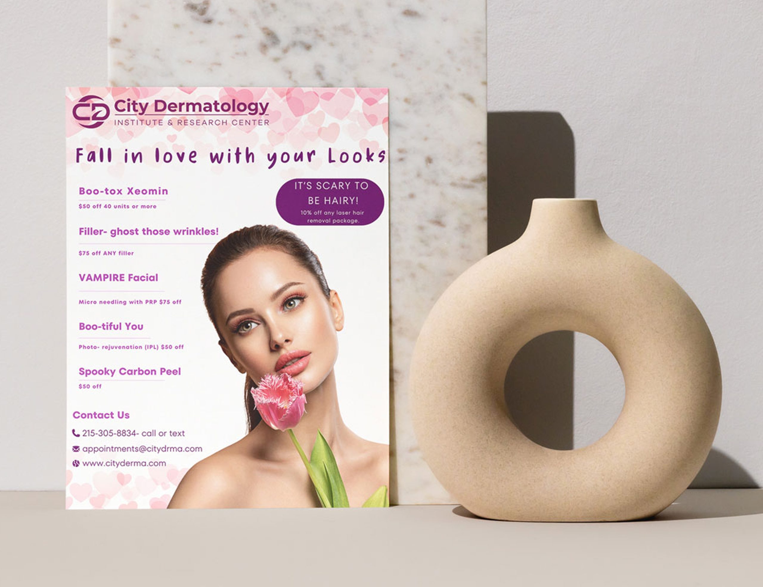


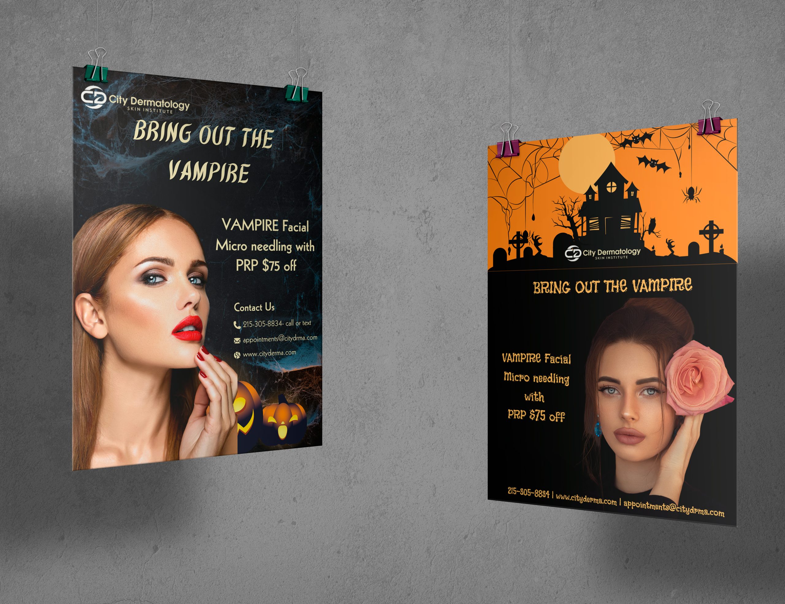
Concept & Creative Direction
For this Halloween promotional series, I developed five distinct poster designs, each with unique visual storytelling while maintaining a cohesive campaign identity. The designs included vampire-themed facials (with dark, alluring aesthetics), haunted house illustrations paired with spa treatments, and spooky visual elements that cleverly referenced both skincare benefits and Halloween mythology.
My creative approach was strategic: each poster was designed not just as standalone promotional material, but as part of an integrated campaign that would work across clinic in-office displays, social media, and digital marketing. I considered how the Halloween narrative could enhance perceived value of seasonal packages, using color psychology (deep oranges, blacks, golds), thematic illustrations, and compelling headline copy to create urgency and drive bookings during the peak Halloween promotion period.

Tools & Skills
Key Skills & Design Capabilities
- Halloween campaign concept development & thematic storytelling
- Multi-poster series design with visual consistency
- Seasonal branding integration with luxury positioning
- Color psychology for promotional impact (Halloween palette)
- Treatment/package promotion through visual narrative
- Print and digital asset optimization for seasonal campaigns

Why It Resonated
What made this Halloween campaign truly successful—and earned it five-star client feedback—was its ability to merge seasonal fun with professional dermatological branding. The poster series didn’t simply use Halloween as visual decoration; instead, it strategically positioned seasonal skincare treatments as exclusive, limited-time offers tied to the Halloween promotion period, creating natural urgency for bookings.
By combining playful, atmospheric visual storytelling with clear promotional messaging and strategic layout, the poster series gave City Dermatology a competitive edge during peak season. The designs captured attention both in-clinic and on social media, while reinforcing the clinic’s premium positioning and treatment expertise. The Halloween-themed aesthetics made the materials highly shareable on social platforms, extending organic reach beyond traditional clinic marketing.
The client especially valued how the posters successfully bridged entertainment and professionalism—driving actual bookings for seasonal packages while elevating the overall brand experience. This approach resulted in a five-star review and enthusiastic praise for understanding how to use seasonal creativity as a strategic business tool.
Client Review
"Marina, is the best, fast turnaround time, very cooperative and great vision!!"
Imran A. Blue Bell, PA, US
Founder&Owner of City dermatology
"Marina, is the best, fast turnaround time, very cooperative and great vision!!"
Imran A. Blue Bell, PA, US
Founder&Owner of City dermatology

